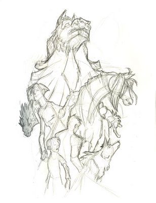
DS Comp Sketch
 This is probably the next thing I'm going to tackle since it turned out so well in sketch mode. As far as composition, I though, who better to crit it before I start in earnest? I figure it'll make a good splash page or wallpaper for the someday website.
Also, I'm doing a quick rewrite of Tapestry based on the feedback I got from my first reader, but I will send it out to everyone.

2 Comments:
THAT is tres cool. I love how it builds and grows towards the top. Can't wait to see it finished!
By Major Sheep, at 04 September, 2006
Well, personally I LOVE these sort of collage-y compositions.. I know you're looking for a more helpful critique...hmm, what would Stephen Hickman say? if I were to do a drawing like this now, after the workshop, I would probably draw the characters sort of tumbling from the side, creating that diagonal movement. But I think you have a nice circular sort of arrangement going on. I'm wondering what you have in mind for background, because a glance this creates sort of a floating teardrop shape in the middle of the page. It'll be interesting to see how you colour it. Anyway, I'm just throwing stuff out there for consideration. I love this, I really enjoy your characters sketches, and I'm really looking forward to seeing this finished!
By LetterGhost, at 05 September, 2006
Post a Comment
<< Home